https://docs.google.com/file/d/12qu57ObLgUHAlOUze1nU27r-0lA_ZKzUlqcDWiM23bnBTRZrGkfbELVX0kIR/edit?usp=sharing
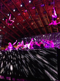
Above is the link to my evaluation powerpoint that has been used to answer all of the questions asked. I couldn't feature music on this but if i had to define one song to feature on my power point, it would be the new Daft Punk song that has been recently released in the past few days called 'Get Lucky' as it helps define my target market who are up to date with the newest music.
Wednesday, 24 April 2013
Final Draft of Double Page Spread
After giving my draft of my double page spread to a group of assessors, They pointed out a number of problems. One of these being that it was all in caps, so I have changed this and although all are still in caps, they look lower case and I believe this font suits the article. I have also added in a bleed for my text so it doesn't run over the page which is another thing they picked up on. I have also added in a piece of text advertising the Vinyls Twitter. Lastly, I've changed the text to size 10 which is what professional magazine designers use for texts on double page spreads, as this was something they pointed out also.


Final Draft Of Contents Page
After giving my first draft of my contents page to a group of assessors, They pointed out a few mistakes that needed to be corrected in order to perfect my magazine. The first one being that I had used the whole amount of pages each article would go on for, were as in Mixmag, which is what my magazine is taking inspiration from, they only list the pages it starts on. I also didn't feature a bleed which real magazines do to stop the text being took of when printing, and I have now featured that and changed the page numbers.


Final Draft of Front Page
Since I handed my draft of my Front Page to a group of assessors, they pointed out a number of problems with it, one being that all the text was in straight boxes unlike my research for Mixmag, so instead I have changed it round in order to have the texts coming from the sides. Another thing was that the text was all the same font, and so I changed this to fit in with my research more. Lastly, on my draft there was no price that could be identified on the front page, so I have put one in to make it look more realistic.


Sunday, 21 April 2013


Saturday, 20 April 2013
Double Page Spread Draft
For my double page spread, I split the page into 3 columns which most professional magazines do, but instead of two thirds writing, I have decided to change it round so my picture fills most of the page. I have used the image of 'Dj Mike Jones' with the black and white affect to cover the page as it is the closest image I have got with technology on show, which helps accompany my article. I again have used the Tahoma font with the title in bold, and the feather gradient affect has again been used with 'The Vinyls' house style green and black colour scheme that is seen throughout. I also included two smaller images of Luciano in Ushuaia and Carl Cox in Space, both taken by me, towards the bottom of the text and this is because they help support my article and are also good pictures. Unfortunately, one image I couldn't fit in my 3 different sets of pages was the one of the young boy playing on the DJ app on the iPad, but I don't think it would fit in with the article so my decision to leave this out stands in the final draft of my double page spread of 'The Vinyl' Magazine. I also increased the distance between the lines for Mikes quote so it stands out and Mixmag also tend to do this, which means it is a professionally used style of writing.


Contents Page Draft
My contents page has took some inspiration from Empire magazine due to the heading being at the top and the page numbers and highlights of the magazine down the left hand side with a main image. I changed my layout from my first draft on paper because I think the way I laid it out looks a lot more professional. I have compared the measurements of my masthead to the empire magazine also, to ensure it isn't too big. I used a image of Steve Lawler I took at Circus on Easter Sunday which again is colourful and draws attention, and have used the same text box tools as the front page, like gradient feathers, to make them blend into each other which looks professional. I have used the Tahoma font again, and all titles are in bold to make them stand out and I think it compliments the front page well. I have also included the image of Ushuaia in Ibiza and this completes the page but it was mainly done to ensure there was no gaps.


Front Cover Draft
Here is my front page for The Vinyl. After looking over my research, I have found that Mixmag magazine puts their logo at the top of the page with a large picture and I have taken this idea on board and put it to use on my own magazine because I believe that it draws attention to the magazine, especially if your picture is bright. I have used my bright green and black house style for all the text and featured the gradient tool on all my text boxes to make sure the two colours are always contrasting. I also used google to find a lime green barcode which fits in with my housestyle. I have used my image of Swedish House Mafia at Milton Keynes Bowl as the front cover image but I have said that it is from Miami as the general feel of this issue of my magazine is Miami Music Week, as SHM played their last ever show there. I believe the fact that my picture has contrasting colours, it works well with my colour scheme and stands out which is good as I want to attract the reader as much as possible. I will keep the same text throughout also like i have done on my front page, and this being Tahoma, as I believe that it works well with the colours and looks professional. This post has been labeled with 'FrontPage' to make it easier to find.
http://atriumfashion.files.wordpress.com/2012/06/cover.png - Here is a magazine cover that features the Swedish House Mafia and is similar to mine with measurements from the top of the page and how it features the main image.

http://atriumfashion.files.wordpress.com/2012/06/cover.png - Here is a magazine cover that features the Swedish House Mafia and is similar to mine with measurements from the top of the page and how it features the main image.

Images for Media Magazine after Photoshop


For this image of Luciano in Ushuaia, I have cropped out a few cameras at the bottom of my image to make it look like a professionally took photo and have left the rest as there isn't much else left to alter in my opinion.

As for this image of my little boy testing out now software, i have cropped out the wellys and shoes in the back ground in order to make it look like a more professional 'bedroom studio' in which hes playing in and have left the corner of the dressing table to hint that dj decks could be there.

This image of Swedish House Mafia at the Milton Keynes Bowl has also been slightly altered to remove some of the heads at the bottom of the picture again to give it the feel of a professionally took photograph.

As for this image of Steve Lawler at Circus Liverpool, there is little I can do to reduce the lighting without ruining the picture so I have slightly used to Polygonic Lasso Tool to select the area and decreased the brightness a bit, but as this picture still remains slightly unclear I may just use it as a decorative image on the likes of the contents page or on small in the front page, as it still gives off a good impression of a rave environment in my opinion.

This is my favorite picture from all of those I have used Photoshop to edit. In this image i used the clone stamp tool to remove the boxes from the bottom left corner and essentially clear the room with view of the floor now to make the environment look more professional. I then used the Polygonic Lasso Tool to select the whole environment apart from the Pioneer CDJ's and turned it into black and white, leaving just the decks in colour. I then selected the decks again with the Polygonic Lasso Tool and increased the brightness for them to stand out even more and I believe that the effect it gives off means the use of photoshop has worked well.

Lastly my image of Ushuaia in Ibiza hasn't been touched because although I would like to remove the shadow and possibly some of the clouds, it is hard to do so without ruining the picture, and with someone who isn't as skilled as maybe a professional is on photoshop, I have left it as it is, as I believe the image still portrays the message I want it too.
Music Mag Pictures before Photoshop
Here are my music magazine images for my music magazine and I have narrowed it down to 7 images, all taken by me in numerous locations. One of the images I took in September 2012 in Ibiza nightclub Ushuaia and I will use this as my front page with the heading 'Ushuaia Ibiza Refurbished'. The second image is a friend of mine taken playing on a pair of Pioneer CDJ 2000's which I am going to use on my double page spread, and say he is testing out new technology. The third is a picture of a little boy and I will also use this on my caption saying he is 'testing out new software' in his 'bedroom studio'. The forth is one of Ushuaia resident DJ, Luciano, and I taken this picture in 2012 in Ushuaia Ibiza, and I will say as he closes his set in Ushuaia he tests out the new software. Fifth is a picture I took myself of Swedish House Mafia at Milton Keynes Bowl, but I will say it was taken at Ultra Music Festival on their last ever show, and I will use this on my contents page. Sixth is a picture of space resident Carl Cox playing in Space 2011 that I took myself in the main room, and I again will say that it was taken inside a club in Miami closing Miami Music Week which will be the main topic inside my magazine. Lastly, I will also use an image of Steve Lawler in Circus Liverpool on Easter Sunday somewhere else in my magazine, and the colours in the image will liven up a page.


Monday, 15 April 2013
Logo for Music Magazine
I have designed my logo for my music magazine, and in this I have took influence from the Mixmag magazine featuring the vinyl disc above the I, but that also supports my name, 'the vinyl.' I have made it in the colour i plan to use for most of my magazine in my house style, which is Black and Lime green and have downloaded a font called 'wire' from www.dafont.com in order to make this, then used photoshop to put the images together to make the finished product.

Moodboard for Music Magazine
Here is a copy of my mood board with features images related to electronic dance music in many different ways. It features skylines from the likes of Detroit and New York that are two of the possible birth places of dance music, it features tickets from the worlds best electronic dance music festival Ultra Music Festival that is featured on Bayfront Park in Miami. As well as this, a promotion poster from Electric Daisy Carnival in New York is featured which is another highly successful dance music festival. An image of Ibiza airport is also featured which is a highly popular holiday destination for all people who enjoy this type of music as world famous dj's play there in the summer season every day of the week. Images from Deep House/Tech DJ Jamie Jones playing from Ultra Music festival as well as the Swedish House Mafia playing at Tomorrowland, Tommy Trash playing at his pool party in Miami and Porter Robinson playing in world famous club Marquee in Las Vegas are also featured as these are big stars in all the different Genres in Electronic music. The feature of the Cream logo is because this is the biggest brand concerned with Dance music. The DJ top 100 magazine heading is also featured, along with the likes of Luciano Cadenza closing in world famous Pacha nightclub in Ibiza, and lastly the Pioneer CDJ 2000 is also featured which is played by almost every house DJ in the world.

Monday, 25 March 2013
Target Audience & Ideas for Music Maazine
Here is a sheet that features all the ideas towards my music magazine with priority on the likes of my target audience.

School Magazine Contents Page

Example of Photoshopped Images for School Magazine


Here is an example of an image I have used photoshop to edit. As you can see the top image is the original, and I have used the spot removal tool and the Clone Stamp tool to replace the dirty wiring on the wall, and dead flowers, leaving the alive ones, to make it look pretty and more appealing. In the process of removing the wiring I needed to remove some of the shadow from the fence, so in order to make this look realistic i needed to remove the whole shadow, and I did so again with the clone stamp and spot removal. In the corner of the picture it features another heavily shadowed unnatractive building that has been cropped out.
School Magazine front page

Mindmap for Music Magazine name
Here is a mindmap screening most things to do with my genre and target audience. I have decided to name my music magazine "The Vinyl" as it showcases my genre due to DJ's using vinyl records. The '.' On the I in Vinyl will feature a vinyl record and this again helps present my genre in the name. This should portray a DJ'ing image to the reader and I aim to present it in a way that the genre is obvious to the reader.

Target Audience for Music Magazine
Here is a page dedicated to my target audience for my music magazine. It personifies who I aim to appeal to and helps justify some of the choices in my magazine.

Second drafts of Newsletter images
Here is a second draft of the pictures i'm going to use for my school newsletter due to the other pictures being a poor quality when opened up on Photoshop.


Monday, 11 March 2013
24/7 Football Spread Annotated
Here is an example of a 24/7 Football Magazine two page spread that has been annotated by me.

School Magazine First Draft Pictures
Here are a number of pictures i've took for my school magazine that will obviously need a few changes. The brightness on a few of them will need to be increased and on the picture of the student outside the Maricourt badge i will need to crop the rubbish out. Also, the libary picture will have to be enhanced using photoshop to ensure that it is clear and lastly the one of the student typing on the laptop will only need a few minor changes. These are the images I have shortlisted to change on photoshop as these are the ones that will look the best when they are finished products.


Thursday, 7 March 2013
Florence NME Anotated Cover
Here is an example of an NME cover that features Florence Welch that has been annotated by me.

Monday, 25 February 2013
First Draft Ideas of School Magazine

This is my first draft mock up of my Maricourt newsletter/magazine and does need a few changes, however the initial ideas are mainly down on this. It features a large but not bold mast head as I think it looks professional, but when it comes down to making the actual magazines front page, the font of the masthead is likely to be a different font and different style that looks more professional. The image of the Maricourt logo is evident next to the masthead which is going to stay when I make my finished draft, because I want it to be evident that it is advertising the Maricourt school. The name 'Maricourt Times' will be my final name for it as a number of names were suggested to a group of my peers and they decided that this was best of the 3, out of 'The Maricourt Monthly' and 'The Maricourt News'. Underneath the masthead also states a shortened down version of the mission statement which will be included when I make my final draft because I believe that it gives an insight into the schools aims and objectives, which I think is vital in a schools magazine. It then features a text box which may differ when I make my final draft as it could tend to look slightly unprofessional and I mightnt want to include as much text on the front cover, nevertheless it features information about the insides of the magazines and eye catching titles of pages that will feature inside to draw the readers attention, as well as following the maroon and yellow house style set as the traditional Maricourt colours which works well over all in a number of ways. Also, the two borders give a nice touch to the magazine and again, the maroon colours helps with the house styles in the Maricourt colours. Lastly, it features an image of the new drama block and a heading that states how much it cost and that it is newly built, which again gives a good impression of the academic and modern aims of the school, which again looks good to the target audience to look modern. The background of the front page is more than likely going to be changed in the final draft of the front page as I believe it looks unprofessional, however it does feature the traditional Maricourt house style colours which I want to stay the colours of whatever back ground I use on the final draft. Finally, there is space on the bottom of my front page which can be used to include pictures or vital information, but I am yet to decide what to put there, but when it comes to making my finishing product that space will be filled with information or pictures, to give it a more professional feel and use the space I have effieciently.
Subscribe to:
Posts (Atom)